
Hello there, fellow WordPress enthusiasts! Today, we’re going to talk about a feature that can significantly impact your website‘s look and feel – content width. More specifically, we’ll be discussing how to change content width for both full and wide widths in the Twenty Twenty-Three WordPress theme. So, buckle up, grab a cup of coffee, and let’s dive in!
Understanding Content Width and Why It Matters
Before we jump into the nitty-gritty, it’s essential to understand what content width is and why it matters. In the simplest terms, content width refers to the amount of horizontal space occupied by the content on your website. This can range from text and images to videos and other media types.
Why does this matter, you ask? Well, the content width plays a significant role in your website’s overall appearance and user experience. For instance, if your content width is too narrow, your text might appear cramped and difficult to read. On the other hand, if it’s too wide, users may have trouble following the flow of the content. Hence, striking the right balance is crucial.
Exploring the Content Width Options in the Twenty Twenty-Three Theme
The Twenty Twenty-Three theme offers two content width options to choose from: Full and Wide. Let’s take a closer look at these options:
- Full width: This option stretches your content to occupy the entire width of the screen, providing an immersive and distraction-free experience for your users. It’s perfect for landing pages or showcasing large images and videos.
- Wide width: The wide width option provides a more conventional look by adding some padding on either side of your content. This layout works well for blogs and other content-heavy websites, where readability is essential.
Now that we’re familiar with the available options, let’s explore how to change content width in the Twenty Twenty-Three theme.
Changing Content Width in Twenty Twenty-Three
To change the content width in the Twenty Twenty-Three theme, follow these simple steps:
1. Log in to Your WordPress Dashboard
First things first, you’ll need to log in to your WordPress dashboard. Once you’re logged in, you should see the dashboard’s main menu on the left-hand side of the screen.
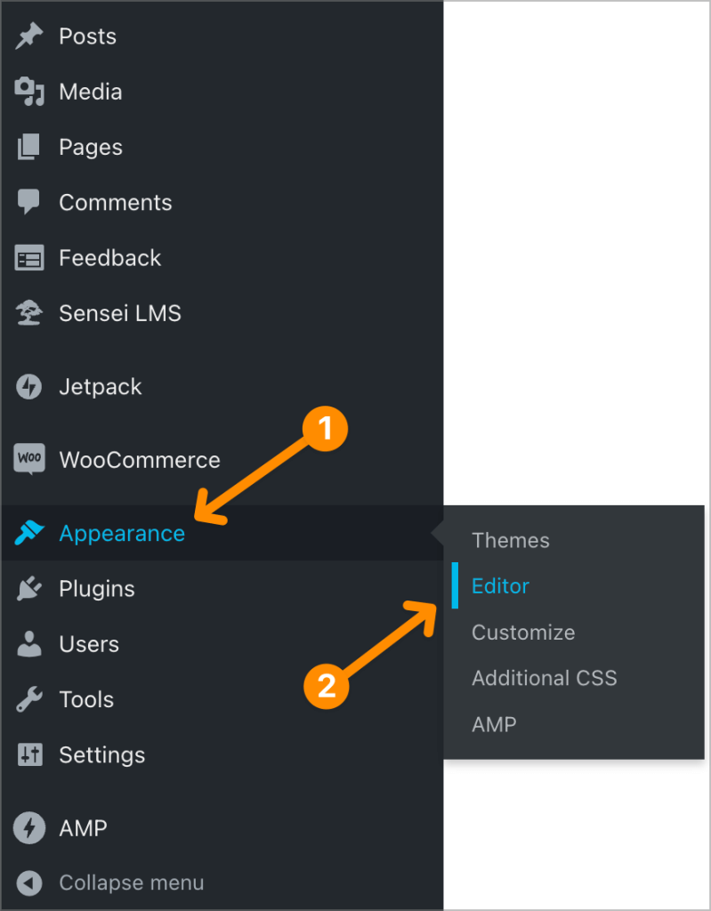
2. Navigate to the Apperance
From the main menu, hover your mouse over the “Appearance” option, and then click on “Editor.” This will open the WordPress Editor, where you can make various adjustments to your theme’s appearance, including content width.
3. Access the Layout Settings
In the Editor, you’ll see a list of different customization options. Locate the “Layout” option and click on it to access the layout settings for the Twenty Twenty-Three theme.
4. Select the Content Width Option
Under the “Layout” settings, you should see a section labeled “Content Width.” Here, you’ll find two options: Full Width and Wide Width. Click on the desired option to set your content width accordingly.
5. Save Your Changes
Once you’ve made your selection, click on the “Publish” button at the top of the Editor to save your changes. Now, your website’s content width should reflect the option you’ve chosen.
How to Access the Site Editor
You can use the Site Editor on our large collection of new themes. When you activate a theme that supports the Site Editor, visit Appearance → Editor to access it:
The Site Editor will then load your site’s front page for you to start editing.
Navigate the Site Editor
Next, we’ll describe the various elements of the Site Editor.
Left Sidebar
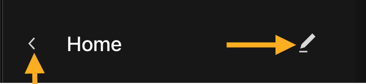
When you click Appearance → Editor, you are taken to the template the homepage uses. On the left-hand side, you’ll see the template name along with two buttons. The pencil button on the right-hand side allows you to edit the selected template.
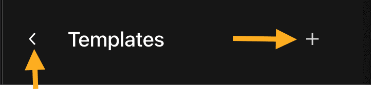
Clicking the arrow button to the left of the template name takes you to other available templates. Choose from the list of templates to edit or click + button to add a new template.
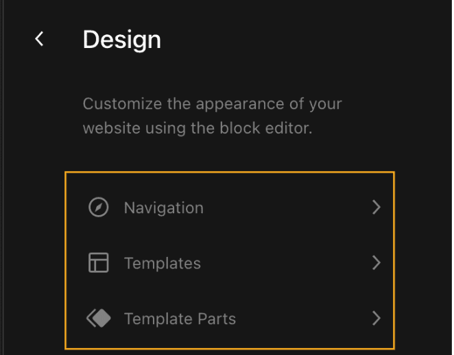
Again, the left arrow button here will take you to the Design options. From here, you can select Navigation, Templates, and Templates Parts.
Top Menu
The top menu includes several important options, each explained below:
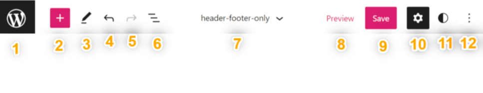
- The site icon: Return to your dashboard or switch to editing templates or template parts.
- The + block inserter button: Add a new block.
- Tools: Choose between editing a block and selecting a block. Choose the Select tool to select individual blocks. Once a block is selected, press the Enter key on your keyboard to return to editing.
- Undo: Reverse the most recent action taken.
- Redo: Un-reverse an action you reversed using the Undo button.
- List View: See a list of all of the blocks that are on the page. This is useful for seeing your page’s structure and editing, moving, and removing blocks. Learn more about List View.
- Template: The name of the template you are editing. Click this and then click Browse all templates to view all of your site’s templates. Learn more about template editing.
- Preview: See what your site looks like with the changes applied.
- Save: Save your changes. Learn more about saving.
- Settings: Display or hide the Template and Block Settings sidebar menu.
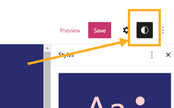
- Styles: Customize the appearance of specific blocks for the whole site. Learn more about working with Styles.
- More Options: Opens additional settings and tools.
Save Changes
When you click the Save button to save changes you’ve made in the Site Editor, it will note the places you’ve made changes to. You can choose to save all or just some of them. Note that some changes (like changes to the Header and Footer templates) will apply to all pages of your site that use those templates and not just the page you were working on.
Reset Changes
If you have saved changes and want to reset those back to the default style, use the Clear Customizations option below.
If you haven’t saved the changes yet, you can exit out of the editor, and the changes you made will not be saved.
If you have already saved the changes, you can revert those changes. Click the name of the template you’re editing, click the three dots next to the template part you want to reset, and click the Clear customizations option:
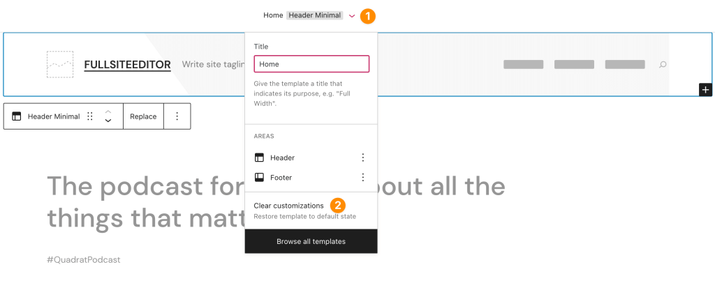
Then, make sure to click Save to save your action of clearing the customizations.
Theme Blocks
The same blocks that work within the page/post editor are compatible with the Site Editor. You’ll find a list of all those blocks here.
A few notable blocks are optimized for the Site Editor, such as the Site Logo block, the Navigation block, and the Query Loop block. View all the Theme Blocks here.
Styles
Use Styles in the Site Editor when you want to choose color palettes, fonts, layouts, and more design aspects that affect your site as a whole. Learn how to use Styles.
Tips for Making the Most of Your Content Width Selection
Now that you know how to change content width in the Twenty Twenty-Three theme, here are a few tips to help you make the most of your selection:
- Consider your website’s purpose: When deciding on a content width, think about the primary goal of your website. If it’s focused on visual storytelling or showcasing your portfolio, a full-width layout might work best. On the other hand, if your site is geared towards delivering written content, a wide-width layout could be more suitable.
- Test on various devices: It’s crucial to ensure that your chosen content width looks good on different devices, such as desktops, tablets, and smartphones. Be sure to test your website on multiple screen sizes to ensure a consistent user experience.
- Keep readability in mind: Regardless of the content width you choose, always prioritize readability. Make sure that your text is easy to read, and don’t forget to use proper formatting, such as headings, bullet points, and paragraph breaks.
- Don’t be afraid to experiment: Feel free to play around with different content width options to see which one best suits your website’s needs. You might be surprised by the impact a simple change can have on your site’s overall appearance and user experience.
Wrapping Up
And there you have it – a step-by-step guide on changing content width in the Twenty Twenty-Three WordPress theme. By understanding the importance of content width and how to adjust it in your theme, you can create a more visually appealing and user-friendly website. So, go ahead, experiment with different content width options, and give your website the makeover it deserves.